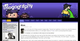
Description:
David Simmer from Artificial Duck Co, Washington sent me an email and asked for some web site layout updates and movable type development.
Project Details:
What David asked for was something that I've enjoyed very much doing, as it beautified his http://www.blogography.com/ Web site even more.
Technical Specifications:
Around the end of August 2009, David Simmer sent me an email request in which he asked for a quote for creating custom templates for his blog using the new movable type 4 modular architecture.
Basically, his Web site was developed using an older version of movable type (prior to the 4 series) and his templates were following that older movable type version architecture. Since movable type 4, six apart changed the templates architecture, making it modular.
Obviously, since David's blog templates containing a lot of customization, starting from meta tags to tracking coding and other kind of coding pieces, he mentioned to me that he wants this customization maintained when I recode his templates based on the movable type 4 framework.
In addition to the above, David wanted me to also:
1. Adjust his Web site Layout
His blog layout was based on a liquid layout which means that the width of the site was covering about 95% of the browser window. In other words, for visitors with low screen resolutions the layout may have been around 1000 pixels wide, while for visitors with high screen resolution, the width of the Web site may have been even double (2000 pixels) and may have made the text unreadable (too many words per line means low readability).
David wanted me to limit this to be compatible with the XGA screen resolution (1024x768).
I've implemented this request by working on the style sheet (CSS) and I've tested the work across Internet Explore v6, Internet Explorer v7 and Internet Explorer v8, Mozilla Firefox, Safari and Opera.
2. Long comments "formatted left..."
David's comments layout contain an avatar photo for each commenter, based on Gravatar.
However, with David's initial Web site layout, the comment text was flowing around the image, which means that when the comment was longer that the height of the image, the additional text went also under the photo.
Well, Dave wanted me to make sure that the commenter avatar remains always on the left and that the comment text, no matter how long it is, staying always on the right of the commenter avatar.
In order to allow this customization, I had to modify a couple of things, starting from the HTML structure, continuing with the CSS style and ending with the movable type template responsible for the comments display.
3. Highlighted Author Comments
This was something quite juicy! Dave wanted me to highlight his own comments with a special background color (a shade of grey), the goal being to have his comments distinguished somehow from his audience comments.
Making this nice customization possible involved some HTML, CSS and movable type work.
4. Threaded Comments
This last part was also something that I've enjoyed doing.
I've implemented many times threaded comments, but now Dave wanted apart from the indentation specific to hierarchy comments to also have a nice arrow which to suggest that a comment is made in reply to the comment above it.
While this task of adding the arrow there wouldn't have been a big deal, with the customization of having the avatar always on the left of the comment text, the arrow job was a bit tricky.
Then, the function behind the threaded comments was all movable type development.
Also here I had to combine HTML, CSS and movable type work.
In the end, what in the world could be nicer than a customer replying:
"Thanks so much for all your hard work... I am very happy with what you've done for me!"
Contracting:
Contracting from Artificial Duck Co, Cashmere, Washington, U.S.A.
Period:
September 2009

