Description:
Letter Cars is a company selling cars in Milan, Italy which wanted to develop a website where to advertise their deals.
Project Details:
Vincenzo Ammirati from Letter Cars, husband of a very nice woman, classmate of mine from the high school, contacted me to develop a website for his car selling business.
Technical Specifications:
From a technical point of view, the client wanted me to come up with the interface design conception, then to code that in web page format and last, but not least, to implement a content management solution for his employees to be able to add/remove/edit car listings.
Interface Design
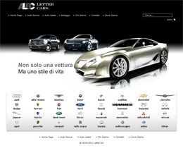
I recall Vincenzo telling me that on the home page he wants 3 cars to come on stage one after another, and during this entrance a specific melody to playing back.
We've got these 3 cars as individual images from him and my designer repainted them, added special effects and produced the flash intro which is available at: http://www.lettercars.it/.
If you would see how badly some of those three generic cars very looking, in terms of painting, you would realize how talented my designer is. I felt like mentioning this, because my designer really did a miracle, especially for the very right car, which has over 40 special effects layers that transformed it completely.
Apart from this, we've produced an interface design based on the principles that the client presented us.
In total, we've produced 8 templates in photoshop format for various page types. Each and every one of them has been refined until the customer was fully satisfied.
Another assignment, after the website has been done, was to also design an offer template, as well as the invoice template with the same theme (logo, colors etc.).
Coding the Website Layout
As soon as the interface design templates have been finalized and approved by the customer, I've started to code them in web page format, in other words to convert them from a flat graphical file into a web page with source code and other elements that are displayed on it (images, stylesheet etc.).
Since I'm focused on quality, I've hand coded all these templates using xhtml/css making sure that the source code is reflecting perfectly the interface design, validates against World Wide Web Consortium specifications and it is cross platform compatible.
Movable Type Integration
I must confess that the phase that I've enjoyed the most was the one of implementing a content management solution over the look and feel that we've produced and I've hand coded in web page format.
Multi-language Setup
When I've produced the site, the client wanted it available in both Italian and English, and doing that was a bit tricky, because I wanted to link a specific car from the Italian site to its correspondent from the English site, so that somebody could switch from a language to another from any page on the site, while still remaining on that very page.
We've implemented the English site at lettercars.com and the Italian one at lettercars.it.
With the time, the client decided that the English version of the site isn't actually necessary because he doesn't have any English-speaking customer and that he would prefer to remain only with the Italian version of the site.
At first, this was a bit discouraging because quite some nice work was invested on producing also the English version and on integrating both languages, but since this change was requested as a phase 2, a few months after the initial project delivery, I didn't have much against it. After all, the client knows betters what his business intentions are.
Car Listing
The most important pages are the actual car listings.
Once a car is entered on the movable type content management solution, this publishing platform automatically created an individual web page for that car listing, based on a specific template for it.
That page contains a bunch of information, from car brand, model, type, age, mileage, paint, interior, interior type, etc., as well as a set of photos presenting that car.
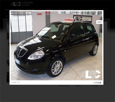
One of these photos is considered the main image and is displayed as a bigger one, while up to nine other images are displayed as thumbnails. As soon as a visitor is clicking an image, it would open up its full size correspondent and from there the visitor could navigate to the previous or next image for that very car listing.
Watermark
We wanted all the car listings'photos to contain a watermark based on the site logo.
I've reached that goal by creating a transparent image with the site logo and then embedding it over each image of each and every car listing.
Sorting by Brand
The cars are sorting by a few criteria, one of them most important ones being the brand.
With this idea in mind, we've listed a bunch of popular brands in the footer, as well as one called "Other" for less popular brand names.
Sorting by Type
Apart from the brand sorting, we wanted to sort the cars by age, so that people could look either for new cars, or for used cars.
Sorting by Other Criteria
We've thought that sorting the cars by age into new cars and used cars wasn't enough, because for the used cars we could end-up with a very long list of cars.
So we've decided to allow people to sort these new cars or used cars by a few other criteria, such as: model, year, mileage and price.
In our opinion these criteria should be enough for a potential customer to easily navigate through the cars my client is offering for sale.
Directions
We've implemented directions in two pages, one called "Dove Siamo" (in Englsih "Where we are"), and the other called "Chi Siamo" (in English "Who we are").
Inside one of these pages we've listed the administrative office address, as well as the showroom address, together with a Google map for real-time directions.
On the other page, we've included another Google map for real-time directions, as well as a number of images taken from the show-room.
Contact
The contact page contains again the address of the two offices, as well as a form that visitors could fill out in order to get in touch with Letter Cars.
Once the form is filled out, a confirmation email goes to the sender, and an email with the sender request is sent to Letter Cars office.
Other Marketing Materials
After the project has been delivered, the client was very satisfied with the way the site looks and is operating and decided to give us another job, which to consist on cobranding some other marketing materials to this graphical concept.
The marketing materials that we've cobranded were an Offer Template done in Microsoft Word and an Invoice Template done in Microsoft Excel.
I've had my designer prepare some mockups and once the client was happy with them, I've personally implemented them on the two templates.
Well, I must confess that in the end I've enjoyed them a lot, myself. This other assignment was a huge step forward from what the client used initially and a way to consolidate the brand.
Movable Type Upgrade
Because I'm a programmer and a technical person like me enjoys technical progress, I could hold myself from recommending my customer to upgrade together the movable type platform used for managing his car listings and from conducting the upgrade technical operation.
With every new release, movable type becomes stronger.
Screenshots
While the LetterCars.it Website could be visited from http://www.lettercars.it/, I would like to share some screenshots with you.
Home Page
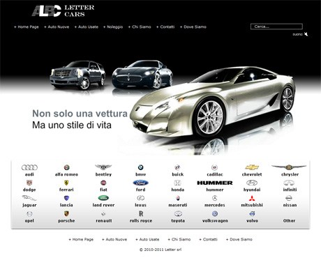
http://www.lettercars.it/
Brand Page
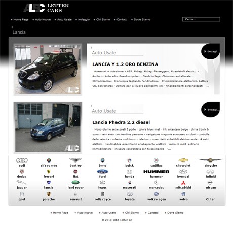
http://www.lettercars.it/lancia/
Type Page
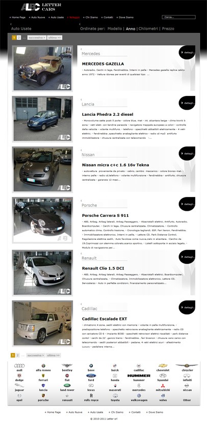
http://www.lettercars.it/auto-usate/
Car Listing Page

http://www.lettercars.it/lancia/lancia-y-12-oro-benzina-riferimento-58.html
Car Listing Gallery
Contracting:
Contracting from Letter SRL, Milano, Italia, E.U.
Period:
May 2010 - August 2010
